What Makes a SaaS Tool Worth Paying For? A User-Centric Framework That Actually Works

Let’s face it, your users don’t care about your backend elegance, or how many features you have in your SaaS application, they only care if it solves their problem – quickly, intuitively, and with as little friction as possible.
So what makes someone pay for your SaaS product, rather than just trying it out? It comes from having a user-centric framework where every interaction, screen and flow is dictated by your user’s success. Whether you’re working with tech platforms for freelancers or building enterprise-grade apps, this framework applies across the board.
This is how to build a SaaS tool that feels worth paying for.
Know Who You’re Building For? Understand Your User Before You Design a Single Pixel
Every product starts with a user. Not a high-level group of “marketers,” or “founders,” but actual people with specific objectives, pain points, and routines. If you don’t know who your user is, you are building blind.
A SaaS tool becomes valuable after it first deeply understands its primary users, and then builds every experience around them. This is not just demographics. What are their pain points? What frustrates them about other tools? What does “done” look like in their workflow?
For example, an analytics dashboard for startup founders should be as lean and intuitive as possible, while the same kind of tool for enterprise executives may require areas of costly pieces and permission settings, along with drill downs.
Make the Experience Effortless, Why UI/UX is the Real Feature That Sells?
A SaaS product development with many features might look appealing on paper; however, users will not navigate through messy screens, cumbersome buttons, and inappropriate processes long enough to appreciate how well it functions. The experience is just as important as the function – and in many instances more important.
The most successful SaaS tools aren’t the ones with the most features, but the tools that reduce friction. Their interfaces are built to help their users accomplish outcomes without using any cognitive load. Whether it is Slack helping their teams collaborate together, or Trello making project management more simpler, they seamlessly navigate users from action to outcome.
To create an experience like this requires all user interactions to be as simple as possible. Every click, scroll, or tap should feel automatic. Their UI needs to be an enabler, not a distractor.
Use the UX success checklist below on any SaaS product to see how it sings.
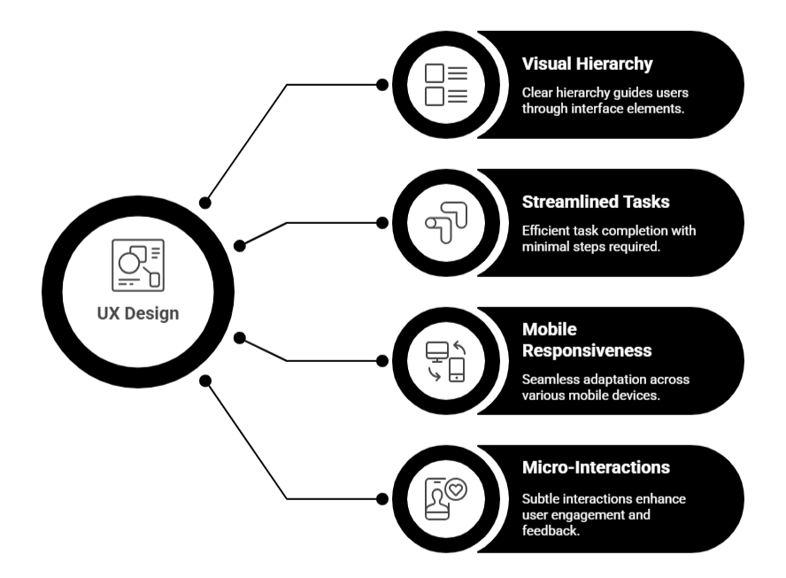
- Clear visual hierarchy and consistency in the navigation patterns throughout.
- A governing number of activities to achieve the core task.
- Responsive design for tablets and mobiles.
- Thoughtful micro-interactions that either guide the user or give feedback.
A great example of this is the service Canva. Rather than overloading users with options, Canva limits the possibility by giving pre-built drag-and-drop templates thus removing complexity and decision fatigue. Even users with no design experience can create polished designs in minutes.
An intuitive interface changes your product from “useful” to “essential”. By allowing users to feel confident navigating an app and getting results, that is when your SaaS tool starts to really justify the price it charges – and actually become worth paying for
Why Onboarding is the Moment That Makes or Breaks Your SaaS Product
When a new user signs up, they are excited and full of hope, but they are also uncertain. The onboarding experience is one of those times that really matter. If user onboarding is confusing, presents obstacles, has unclear next steps, or simply takes too long, at best users will lose their initial excitement, and at worst they will become frustrated. Frustration is the hardest state of mind to overcome.
Onboarding is so much more than a tutorial. It is your opportunity to deliver value quickly and make the case for your product upfront. You should think of onboarding as the elevator pitch for your app; instead of words, you are walking the user through an experience that will lead to their first win.
A nice onboarding flow will reduce overwhelm and give the user a clear and confidence-start. It will help them remain less confused and only take them step by step, without assuming any prior knowledge. Great SaaS products don’t throw users into the deep end; they walk alongside them.
Take Duolingo, for instance. Within three clicks, you’re on your way to learning a new language. Duolingo doesn’t need to provide any additional instructions, as their entire product is built to instruct you as you go. Users experience momentum almost instantaneously, which breeds trust.
To create an onboarding experience that will turn free users into paying users, include…
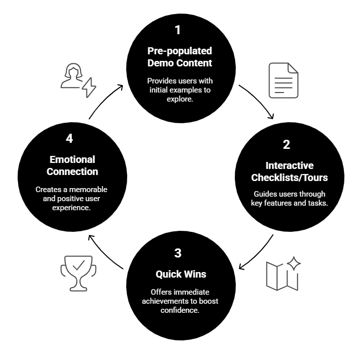
- Pre-populated demo content to avoid blank screens and give users a feel of a “live” product
- Interactive checklists or guided product tours to highlight important features
- Quick small wins to demonstrate usefulness of the product (e.g. “Your first campaign is live” or “Your first report is ready”)
When users approach or immediately pass their “ah-ha” moment, they start to connect emotionally with your product. They’re not just seeing what your tool does—they’re feeling why it matters. The emotional payoff is what turns a trial into a paid plan.
A great onboarding flow is one of the biggest levers you have to drive growth. Put time and energy into it, test it, and continue to work on it until a majority of users say “This is exactly what I was looking for.”
Keep Users Hooked by Delivering Value Beyond the First Click
Designing an excellent SaaS product is not a singular event; it is a journey. User needs will change, expectations will increase and competitors will shift as well. If you aren’t listening or iterating, you are losing ground.
This is where activation is an important milestone. Activation is where users think “Wow, this tool is exactly what I needed.” Activation is the first milestone to long-term user engagement and conversion.
To help activate users, find out what the actual actions look like that indicate value for the user. It could be a user sending a message, creating a campaign, connecting a third-party tool, or completing a workflow. Then design the interface for users to get to that action as quickly and transparently as possible.
Great metrics to track on activation and retention:
- Time to first meaningful action (TTFMA)
- Feature adoption rate
- Session length and returning reuse frequency
A practical example: Slack starts collaboration on the team level right off the bat. It gently pushes users, allows invites, creates channels, etc., all within a couple of minutes. These are lightweight, yet meaningful actions that create habits and dependencies.
When users reach activation and start to perceive recurring value from your tool, they stop thinking of it as a trial and start thinking about it as mandatory. That’s the change that creates conversions and loyalty long-term.
Let Your Product Vision Shape Every Interaction With Intentional Design
A well-defined and purposeful product vision underpins every easy and intuitive experience in SaaS. Without a clear product vision, features become scattered, the interface becomes inconsistent, and users start to wonder why your tool exists.
A strong product vision gets your team aligned and makes sure every design decision they make is in service of a real user outcome. It’s not about making whatever is trending, it’s about making what matters. When a product is made with purpose, users know it. They aren’t distracted or overwhelmed by a bunch of bells and whistles; they are moved through a journey with intention and confidence.
When considering adding a new feature or changing a workflow, ask: is this really going to help the user be successful, or is it just something nice to have? If it does not uniquely tie to the product’s core value proposition, it is probably more of a distraction than it is an improvement.
Think about how tools like Linear and Superhuman flourish. They are not trying to be everything for everyone, rather they care about being really good at doing a small number of things: fast task management for product teams, or efficient email workflows for power users. You can feel their focus in every pixel and decision.
Price Like a Pro by Building Trust Through Transparent, Value-Based Models
You have accomplished having a product that perceptually aligns with the awareness of your users’ mental models and needs. The next step is pricing your service. Pricing is where a lot of SaaS products experience abandonment – not in terms of price – but in not being easily digestible, contrived, or perceived as unfair.
As previously mentioned, an important thing to remember is pricing should be related to perceived value and not associated with features. Users don’t want to feel like they’re paying for fluff. They want pricing that reflects their personal intuition for pricing related to each result they receive. When pricing aligns with actual user outcomes and usage patterns, it spends seed money on building trust, and in turn, boost conversions.
Smart pricing reflects real-world value—not just feature checklists. One of the best ways to approach this is by using a project-based pricing estimator that helps align what users pay with the results they receive.
Smart models:
- Usage pricing (Think Zapier or AWS) – customer pays for usage
- Seat pricing (Think Slack or Asana) – customers pay per seat and pricing grows proportionately with size of the team
- Freemium with upgrade triggers (Think Canva, Grammarly) – user gets some value on the freemium tier to create urgency to upgrade for maximum value
Most importantly, be transparent. Hidden fees, ambiguous terms, and locked features do -not- stimulate positive action. Practices like forced annual billing without a monthly option or charging additional costs for core functionality like add-ons will lose trust with users fast.
When your pricing aligns with the user journey and growth, it is part of the value story not a blocker. When your pricing is truthful and value based; you are signaling to the user that you are trying to work with them, and if they are paying at this stage, it could be a large reason, or driving factor they will pay.
Keep Getting Better by Using Feedback Loops to Continuously Improve
Creating a top-notch SaaS product is not a one-time feat; it is an ongoing journey. User needs will evolve, expectations will climb, and competitors will change as well. If you aren’t listening or iterating, you are losing ground.
Everyone talks about “keep optimizing” to stay relevant and maintain value over time. Optimizing doesn’t have to come from large, substantial changes; it can just be staying consistent with how actual real users are interacting with your tool.
Some good, effective feedback loops to weave into your process include:
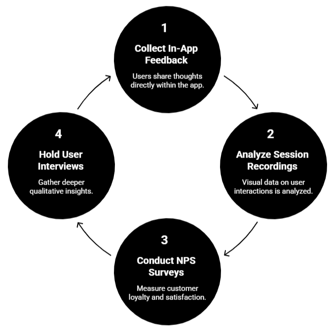
- Consider the in-app feedback tools available such as thumbs up/down, or net promoter score (NPS) prompts
- Session Recordings / Heatmaps that can expose friction points along real user journeys
- Quarterly user interviews, these can create a new opportunity and miss expectations in deeper conversations.
Staying on top of trending SaaS tools in 2025 will offer clues into what today’s modern users anticipate from your interface and experience, rather than learning from your peer products on what has worked and hasn’t, top-performing tools and even mainstream tools will allow you to take a proactive approach, rather than a reactive one.
Often, small insights create the biggest changes; often small UI changes from user behavior can grow retention more than deploying a large and new feature. The goal is to stay aligned with what your users want, not what you think your users want.
And, let’s also say this; the moment you stop listening to your users, your competitors will be ramping up. Companies like Figma and Miro have seen meteoric growth by listening to their community and turning feedback into real-time improvements which garnered them not just users, but fans.
When you cultivate a culture of endless feedback and iteration, you don’t just remain competitive; your product is irreplaceable.
Real SaaS Tools That Users Happily Pay For And What We Can Learn From Them
At this stage, theory is wonderful but what does success look like in practice? Let’s take a look at a few exemplary SaaS products that not only get leads, but convert them into loyal, paying customers.
These tools do not aim to do everything, they are focused on doing one thing well. They empower users, streamline workflows, and instill confidence. They are equally important in line with great digital marketing practice for SaaS, simplicity and usability, which makes them easily found, and enticing before they even sign up.
Notion
Notion still maintains its minimalist UI, while also boasting flexible pieces for note taking, task management, collaboration, etc. You can see with teams and individuals the immense workflow adaptation, it’s also easy to see its value for the user. Notion’s UI, while containing similar features with other tools, empowers users without the baggage of information overload and causes no intimidation to new users. The glue that gets people coming back is that they can work in a way that works for them without being forced to use rigid templates.
Calendly
Calendly takes all the friction away from meeting scheduling with other people. There’s nothing else going on, just a laser focus on solving a universal problem: how to find a time to meet. Their design is clean, fast setup and syncs seamlessly into your calendar. Users feel like they’ve just gained hours back in their week.
Grammarly
Grammarly hooks users in seconds – no matter whether they are writing an email or editing a report, users quickly see their changes get better, using real-time suggestions. It’s an invisible assistant in the background until you decide to use it.
Each of these tools work well not because they have long feature lists, but because they addressed a specific problem that their users have early on, provided instant value, and designed workflows that are intuitive to their users real-life behaviors.
When your SaaS product can make your users feel even just a little bit more able, productive, or confident, they won’t look at your product as an expense, they will look at it as a benefit.
Conclusion:
A SaaS product is a worthwhile investment for a user when it solves a specific problem, provides value quickly, and is easy to use. If the experience is truly easy to onboard, the user feels the interface is intuitive and they can continuously see the value in features, they will gladly pay.
Your pricing should ideally reflect that value. Plainly: There should be no surprises, confusion or hidden add ons. If some of these areas are lacking, it is a cue to refocus on the users needs. A focused, user-first process will allow you to guide your product in the right director.


